
Ipiccy
13. Photo Effects.
This is another large section and as its name suggests you can apply many different effects.
There 7 parts here starting at Basic. Other parts are Vintage, Area, Colour, Artistic, Miscellaneous and.Advanced.
Go to the third icon down from the left menu.

Whew!
14. Basic.
a). Black & White. This is a clever piece of software since it allows you to alter the colour on a swatch.
This is not the colour of the image but the colour of a filter that could have been put on the front of the camera lens as we used to do in the days of film. Try sliding the spot along the bottom edge of the little box. There is a brush to erase or paint on the technique.
b). Sepia. One click and you have a sepia image. If the exact shade is not to your liking there is an adjustment you can make. There is a brush to erase or paint on the technique.
c). Soften Image. Again a very similar method of working but here there is the addition of the Revert Mask. Clicking this has the effect of reversing how the filter operates. This means that if you have not used the Brush to remove the softening effect then the technique will have no effect.
d). Orton Effect. This is an effect invent by Mr Orton and it simulates his film method by having two layers of the image. One is very blurred and put on top of the sharp version. They are then blended together. This boosts the contrast and colour as well as giving a dreamy feel to the image. By sliding the Fade control to 100% you can check the extent of the effect.
e). Matte and Vignette. Both these give you a similar effect. Matte has a rather curious vignette in a bright colour of your choosing. The depth of colour changes from bottom to top.
15. Vintage
This set of effects are all similar in the way they operate. Basically you have no control other than the fade and using the brush to remove the effect where you wish. The last one is Lomo. This is named after an old Russian film camera that produced crummy photos but still has a world wide following. This is the digital equivalent of the way the camera worked.
16. Area.
This section gives you various ways of blurring gently or softening parts of your images. My favourite among
these is the Focal Pixelate.
17. Colour
This set of controls is able to give you some great colour effects.
Duotone for instance converts your image to two colours.
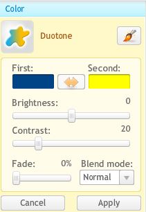
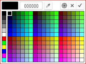
Initially it is set to Blue and Yellow. The colours can be swapped round using the double headed arrow between the colours. By clicking on one of the colour patches a Colour Picker appears as shown below. Move your cursor with the left mouse key anywhere in the rectangle of colours.
The Eye Dropper is used to get a sample of a colour from your image.
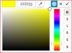
A second colour control is found by clicking the spoked wheel icon. The further up you move the spot the fainter or more pastelly the colour becomes until it becomes white. If you move the small black circle using the mouse with left key pressed down you can change the main colour [here it is Yellow] to all its shades from Black to White. Click the Tick to commit.
The slider below takes the colour from light on the right to totally black versions on the left. There is a more lot to say about this but it is too advanced for now.
On top of all this you have controls for the Brightness and Contrast. This may not sound much but the effects obtainable are remarkable especially when combined with one of the Blend Modes and the Fade control.
Do not forget the Brush icon at top right. Use this to remove the duotone effect where you want.
Rainbow and Cross Process are best forgotten but Gritty is great and worth trying. The effect is a little akin to the HDR Picture effect [see the Advanced section further down the iPiccy menu and compare].
The Infra Red filter works brilliantly with the appropriate starting image such as this one of an Olive Grove.
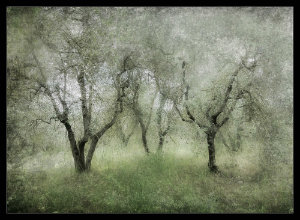
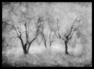
Olive Grove
converted to Infra
Red and darkened
using Curves.
The Bloom control has a softening and a warming effect that can work well on portraits as here.
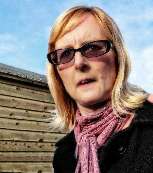 before
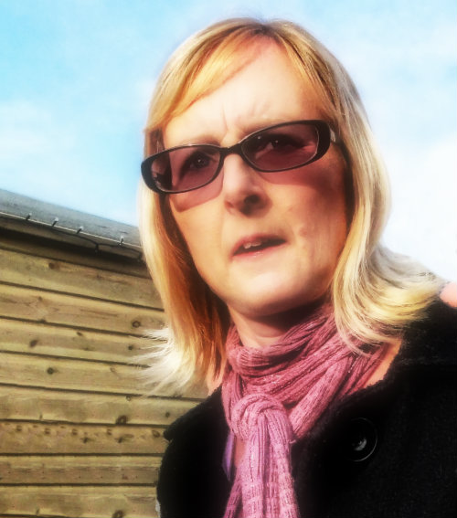 after
after
Vibrance boosts the saturation
of the colours whilst Colour
Tint allows you to make a
monochrome photo in any
colour.
18. Artistic
This set of controls can get your creative juices flowing.
There are 9 options here namely Pencil Sketch, Bokeh, Cinemascope, Posterise,Scanlines, Pencil Drawing, Shine, Retro Comic and Cartooniser.
Bokeh is hard to get a useful final image. Try the following setting Real Bokeh, Lens = Sparkle, Style = Vivid, Amount = 60, Size = 20 , Rotation = 27, Fade = 16% and Blend = Normal. Then use the Brush to reduce the effect where desired.
Shine will produce Suns Rays easily. They colour can be changed by clicking on the sample colour
and moving the dot. If the Colorize is unticked the rays are neutral
monochrome. Moving the Radius lets you choose a clear area. The
radius position is moved by to an appropriate position and so is the size.
An example here called Arms and
the Girl.
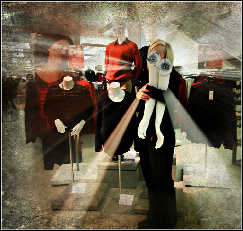
Cartooniser if set to Colour Levels = 20, Smoothness = 1 the image is almost as the original. Move sliders from this starting point.
NB the Posterise control has a similar effect. Compare the two.
Pencil Drawing does not seem to work well on landscapes but on an image of a sunflower I was able to simulate falling rain quite effectively.
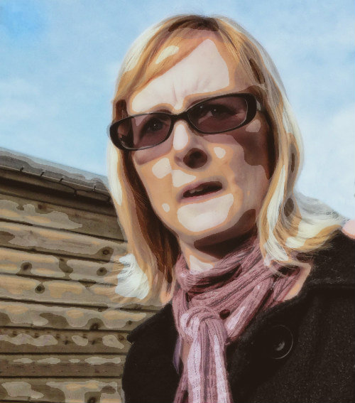
Posterise is quite different from the Photoshop version. It has a Detail slider and a Fade control as well as the Brush control. It works well on photos with bold colours.. See below. Here 4 colours were used plus Fade of 32% and Detail of 50%.
18. Miscellaneous
There are eight choices here including Old Photo, Snow and Liquify are useful. But Wanted Poster and Pixelate are best forgotten. Weaver is of limited use. Please let me know of one.
Then there are Cyber Vision and Neon Glow. Well they may be fun I suppose. Shocking certainly.
Liquify is worth exploring. Have you noticed that Liquify is also found below Levels and under the Retouch > Advanced
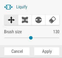
The controls are Move, Pucker, Bloat and Erase plus Brush Size. Move has the effect of moving parts of the image so that you can bend a church spire or a tree. It works very well.
Pucker and Bloat squish or fatten parts of the image. Fun control to use.
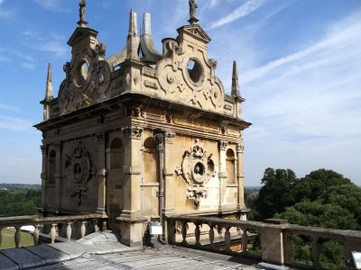
Slide you cursor over this image to see the before and after result
of using Move and then Pucker
19. Advanced (time consuming)
I recommend that if you use this section that you reduce the size of your image to reduce the processing time. Try 500 pixels wide to see if you like the effect and then increase to a normal size later and be prepared to wait.
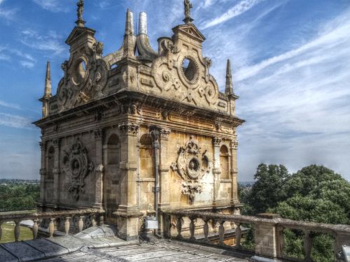
The set here has some good effects but others need to be treated with caution. These are HDR Picture and Artistic Painting.
HDR Picture can produce some magical results as shown here.
This takes us to the end of the first two major ways that iPiccy can control images.
There are still six other categories to look at. See the page 85.
Enable Image Storage video describes the enabling of this control that allows you to keep photos ready for use in iPiccy. This is needed for Collage for instance.