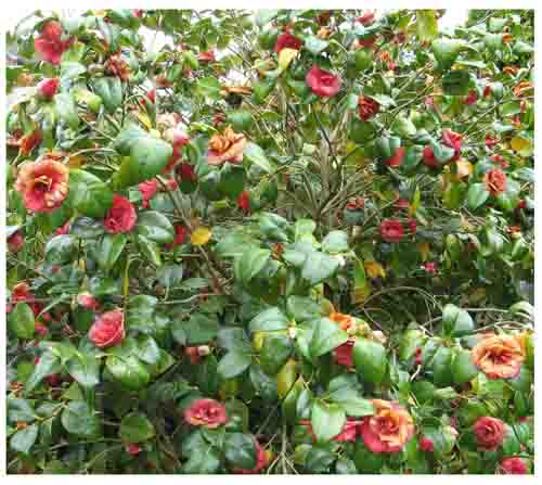
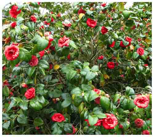
This simple technique was devised by Allan Bush for us. Below are his words for the method.
My camellia produces a progression of flowers so that some early ones may be brown and withered while others are still in bud. I tried putting some colour back into some of the poorer specimens using the following technique.
1. Copy the photo in need of adjustment and make a duplicate layer.
2. Using the selection brush select the poorer blooms. [But see 7 below]
3. Click on a part of one of the brighter blooms with the eyedropper tool to choose an appropriate foreground colour.
4. With the paint bucket tool set the mode to colour and opacity to 70% and click on the selection to fill with the foreground colour. (I am not sure how the tolerance works. Does it relate to the contrast? See 4a.)
4a. The tolerance works like that in the Magic Wand. The larger the tolerance the more paint the Bucket puts down within the colour tolerance you set. Try this with say 10% and then 100% and note the difference. It does not relate to Contrast therefore.
5. By making a further adjustment layer using Hue and Saturation the saturation can be boosted while still maintaining the hue of the original flower and retaining the detail in the petals.
6. Once satisfied click OK, deselect and flatten the image for the final picture.
7. The Bucket works a bit like the Magic Wand so that when you have picked a colour and without
selection, any part of the image can be painted with that colour just by clicking on that part. In this case with
the Camellia blooms since these are well defined areas you just need to click on that part with a tolerance up
to 100%. The larger the tolerance the more likely that the colour will spread further than you want. At this
point reduce the tolerance just as you do with Magic Wand. By selecting here you will prevent the colour spreading