Good composition is often about simplifying – eliminating any superfluous elements in your images so that you're just left with the important stuff. You should be doing this when you compose a photo in the first place, but you can also do it by cropping in post-processing. If you crop from a normal frame to a square, you’re shaving off a third of the image, leaving the strongest two-thirds [hopefully].
This is a creative exercise that you can carry out on photos you already have. It’s a great way of improving images that have too much empty space either side of the main subject. It’s worth taking some time to go back over old images and see if you can improve them by cropping to a square.
The above image is an example of a good photo that became better once it was cropped to a square.
Deliberate Framing
Another approach is to take photos that you intend to crop to the square format. Because you are aware that you will crop the image afterwards, you can take care to compose it in a way that suits the square format.
Another approach is to take photos that you intend to crop to the square format. Because you are aware that
you will crop the image afterwards, you can take care to compose it in a way that suits the square format.
The other elements that become more prominent in the square format are
shapes and line. Look for shapes – such as triangles, squares and circles
in your subject when you compose your subject. Lines also become
stronger as they pull the viewer’s eye through the frame.
This Dandelion head uses the square format well and the stalk is a line that leads the viewer’s eye right to it.
Black and White Square Photos are Beautiful
The square format as the fine art photographer’s format. There are lots of fine art photographers that shoot
almost exclusively in black and white and use the square format. In black and white, shapes and line become
more prominent without the distraction of colour – black and white seems to make the most attractive elements
of the square format even stronger.
Take a close look at Joseph Hoflehner’s work for brilliant examples.
See this link http://www.josefhoflehner.com/iceland.html
Really look at his work. Josef’s work is deceptively simple, yet he has a remarkable eye for tone and composition. How does he use shape? Tone? Line? Contrast? Negative space? Analysing the work of photographers that you admire, then applying what you learn to your own photography, is a good way of learning.
Composing with a Square
A square is a perfectly balanced shape. Each side is equal in length. Using the square format encourages
the eye to move around the frame in a circle. This is different to the rectangular frame, where the eye is
encouraged to move from side to side (in the landscape format) or up and down (in the portrait format).
There are many factors that influence the way the eye moves around a photo, including the use of line,
texture, colour, selective focus and negative space. But the shape of the frame is a major factor.
This is shown in these two photographs. The eye will roam in a
circular manner in the Wedding Photograph of Pam’s.
Space
Negative space is the term used to describe the empty space in an image around the subject. Composition is
often improved by getting closer to the subject. But sometimes you can create atmosphere or emphasise the
shape of the subject by including negative space around it. In the rectangular frame, this can be difficult to do
as it results in a lot of empty space. But it can be very effective in the square format.
Look at these examples.
Which do you prefer? There is no right answer – it’s entirely subjective.
But it’s interesting how the dynamic
of the image is changed by a single crop.
Circle within a Square
The symbolism of the Circle within the square goes back hundreds of years. Celestial objects visible to the eye are generally circular and this transfers to various art forms. This occurs in many cultures such as the Zia in New Mexico.
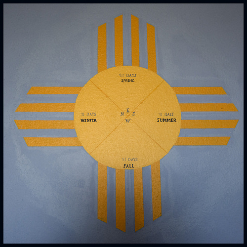
The Zia symbol.
Reasons to use this style are that it includes wholeness, infinity and inclusion. The Zia symbol deicts the sun shining in four directions and four seasons and the repetitive cycle of life.
It is a very strong composition and you will see lots of examples such as a church clock.
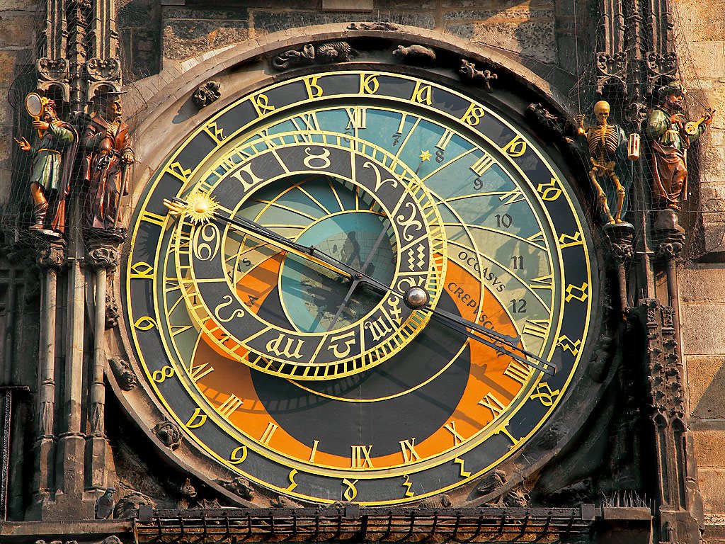
or a manhole cover or a mirror reflection or a cafe sign.

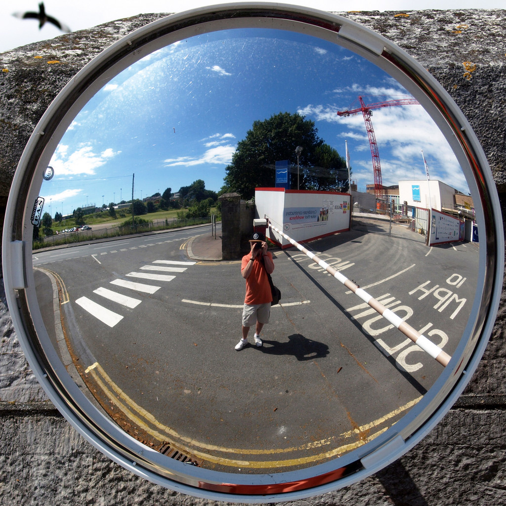
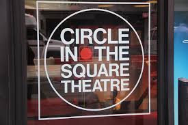
There is no need to stop at a circle. A square or diamond work well as does a Triangle.
Below are some templates that could be used to add your images.