
Since you are all likely to have different printers we can only give you general guidelines. You may have to consult your printer manual for further information.
We believe that to produce prints that are of photographic quality then it is essential to use Photo Quality paper. Each printer make has paper suitable for their machine and usually this will be the best sort to use. In a later section we discuss the use of other papers and why you may wish to print on them as well as the problems they can cause. So for the moment use the printer maker's papers.
You can use the Print dialog box to print your images in just a few steps.
Before printing, make sure the file is sized for your printer. Some printers can print very large files, while others cannot, and some may take a long time to print. Check your printer documentation for size limitations. To make files smaller, consider:
Choosing Image > Resize Image to reduce resolution or Height and Width.
Choosing Layers > Flatten Image to flatten the file (see DigPhoto8 Unit for more details).
We show you how to cope with many aspects of Printing as follows:-
3. Profiles
5. Test Prints
To be able to take part in a meaningful way it is important that the monitor screen you are using is set for digital imaging. When set up this way the monitor is perfect for all other uses too. Flat screens may not be able to be controlled completely.
The method is to use Adobe Gamma. This is a piece of software that is automatically inserted onto your computer when you installed Adobe Photoshop Elements 2.0 or 3.0. To find it go to Control Panel. This is found by pressing the Start key and selecting Settings and then selecting Control Panel. Here you should see Adobe Gamma. Click this and the following Box appears.

Use the Step-by-Step wizard and click Next.
In the screen that follows ignore the request to give a name.
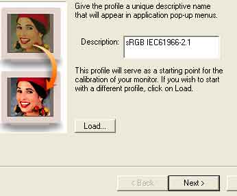
Just click on Next. This brings you the next item. This is where things get a bit tricky since how you alter the brightness depends on the specific monitor that you have. If it is a flat one you may have no control at all. The picture shown is exaggerated so that the middle grey square is too light. This might not be apparent on your monitor.
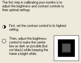
Having adjusted the contrast and brightness then click on Next.
Below is the box you will see.
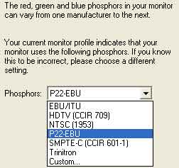
We have chosen P22-EBU since we were told this is a good general phosphor, and it seems to work for us.
The following box is fun. Try adjusting the slider as requested. Leave the gamma at 2.2. [If you are using an Apple Mac then set the gamma to 1.8]. Then click on the View Single Gamma Only .
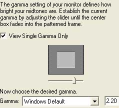
The box below shows more fun still. We find that the green box is the most difficult to set. Click Next.
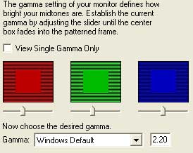
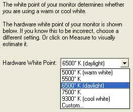
The box above shows that we chose 6500°K. This is just fine. Click next and choose Same as Hardware on the next screen. The screen after this is able to show you before and after. Try clicking on the two radio buttons. Click Finish whereupon the Save box appears. Put in a suitable name. We always include the date as a string of digits. You have finished adjusting your monitor.
On Ian Lyons site he describes the same process. You may prefer his version that is on http://www.computer-darkroom.com/ps7-colour/ps7_2.htm . Ignore
the Photoshop 7 references.
Also the built-in help file for Elements can be read. If you have problems refer to this. It is at C:\Program Files\Adobe\Photoshop Elements 2\Help\help.html on our computer. Open your Browser and then open this file.
Using Adobe Gamma is not the only system you can use and we have used Quick Gamma and have found that
this does give better results. If you look at this page you can see not only how complicated this business
is but how to use and download Quick Gamma (it is 500Kb) only.
http://www.normankoren.com/makingfineprints1A.html
Well worth while and free thanks to Mr Koren.
Now the foregoing procedure will work in the majority of cases but it is highly critical on the setting of the 3 colours and it depends on your eye and if you are slightly colour blind. In fact it is not possible to get an accurate result.
One other problem is that monitors change their colours with time and by this we mean on a monthly basis at least. Professionals reset their monitors on a daily basis.
So a better way has been invented that is not dependent on your eyes but works on absolute values.
This system uses a gadget that sticks temporarily to the monitor screen and measures the colours emitted during a sequence. Any deviation from a built-in standard of colour causes the software to alter the screen colours to ensure that it is right. Having completed the sequence you are asked to save the profile. Later the software will nag you to repeat the cailbration. We set this to once per month.
This is not a cheap option but it does save a lot of paper and frustration. In a recent edition [August 2006] of Digital Photo magazine there was a review of several of these calibrators at the low end of the price range. We use a Gretag Macbeth Eye
One Match 3. Prices are coming down but will never be cheap since they are precision devices and not bought in huge quatities.
To add more complication there is one more area that must be looked at. Having got the monitor cailbrated your system must now send the file for an image to the printer and without control then the results can be hopeless. The printer itself can control the colours and this can work very well if everything is in your favour.
Look at http://www.normankoren.com/printer_calibration.html and http://www.normankoren.com/color_management_3.html
and also Ian Lyon's site for Epson printer users
http://www.computer-darkroom.com/media_profiles/media_print_1.htm
for more details.
For Ilford papers you can try using profiles that you can download from http://www.ilford.com/en/support/printer-profiles/
Do one of the following:
• Choose File > Print Preview (or Ctrl+P).
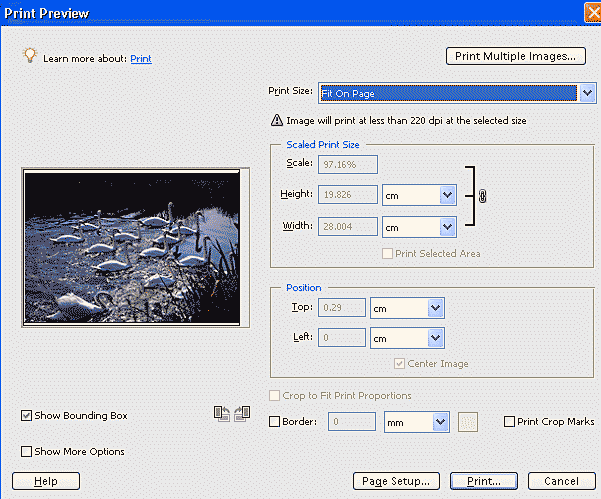 Print Preview
for PSE3 & 4
Print Preview
for PSE3 & 4
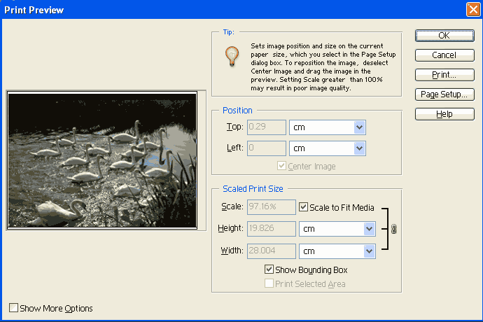 Print Preview for PSE2
Please notice that there is a Show More Options box that is unticked here. Later we shall discuss the use of these options.
• This box appears and you can see that we have scaled the imaged by 97%. This was done by clicking on Fit on Page (PSE3 & 4 ) or Scale Fit to Media (PSE2). This is the easy and quick way to size your image. Next click on Page Setup…
• When the Page Setup dialogue box appears, select the Orientation and then click on Printer…
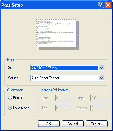
• This brings up another box
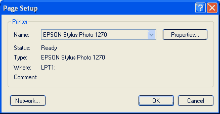
Select the Printer and then Properties to ensure the correct settings are made. From now on
what you do will depend on the actual Printer you have.
• If you are printing more than one copy, enter the number of copies. Most people print one copy to check that all is well and then print off the required number.
• Click OK to print your file.
Clearly it is a good idea to get into the habit of making test prints. For old darkroom workers this is second nature. You used to make test strips in the darkroom but there is no need to do this in Digital Imaging. We can now change the size of the image just for testing purposes.
In the Digital Imaging world we now have the great advantage of being able to print a miniature version of the whole image to check on parameters like colour and contrast. Then, having perhaps changed various parameters, we can scale up to full size again without any worries about these parameters being wrong when rescaled.
 Making Test Prints
(PSE3 & 4 )
Making Test Prints
(PSE3 & 4 )
 Making Test Prints (PSE2)
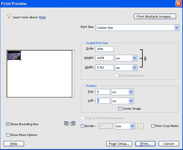
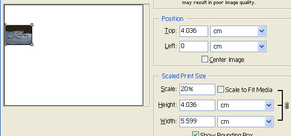
This box illustrates how we now make tests. First we size the image as we want the final print. In this case we have A4 size. Then we change the Scale box to read 20% or 25%. The image will now be in the middle of the printing area.
Now remove the tick in the Centre Image box. Change the Top box to read 0 and also for the Left box. You will end with the situation as shown here. Now click Print… and follow the printer ' s instructions.
Suppose that you have made a test and the colour of the print is too Magenta we make changes as described
later in this course. We now wish to make another small test print on the same sheet of paper
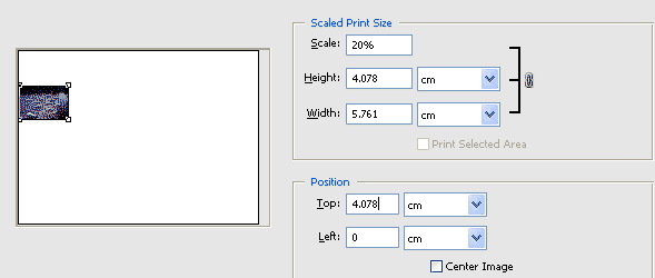
BUT not on top of the test just made. All we have to do is alter the numbers in the top and
left boxes. In this case in order to put the test image alongside the old one we add the Height
(here it is 4.078 cm or 4.036 cm (PSE2) to the Top box. This results in the following box.
 Making a second
Test Print (PSE3)
Making a second
Test Print (PSE3)
 Making a second Test Print
(PSE2)
Making a second Test Print
(PSE2)
The new image is shifted exactly the height of the image and so will not overlap. When printed we can easily compare these two tests. You may like to add a little more so that there is a gap between the tests. We find that some of our test prints are suitable for cutting out and sticking onto a small piece of card to act as a Business card or a greetings card. So even the good test pieces can be put to good use.
You may have already considered making your own Greetings Cards and if so you may wish to skip this
part.
Over the years, at Christmas, we have received cards made in many ways from photographic friends. There
is something more personal in a card that has been skilfully made and you know took longer than buying
in a shop. At this point we must stress that they do not come cheap, if you add the cost
of paper, envelopes, and ink alone. Further there is the cost of a computer, scanner, printer
and the camera with a trip to exotic places on top! Never mind you had fun!
NB It is wise when making cards to think first of the envelope sizes available and
then design the card to fit. Also, most printers will not print up to the edge of the paper
so keep the text and image at least 1cm from the edge.
We will start with the easiest method. Print your chosen image on ink jet paper. You could
use a border to set it off now! All you need to do is trim it to the required size and stick
it on the front of your card. For the card you could use some nice, but expensive, cartridge
paper to mount it on but remember to be sure it is thick enough to stand and also that it will fit
an envelope. The greeting can be written inside or you can print the message on plain paper and
stick it in.
There is a way of printing a batch of prints on one sheet of paper should you want to have the same
image on each card. Go to File> Batch Processing or File>Print Multiple Photos for PSE3
and 4. The Help File will instruct you.
Another method uses Photographic Quality Paper, and is folded after printing to form a portrait or
landscape card. We will use an A4 sheet so this will produce an A6 card.
It is important in this method to plan where the picture and script will be on the folded paper. I
would recommend you take an A4 sheet of plain typing paper fold it in half and make decisions where
script and pictures will be printed.
Keep this sheet of paper to make sure you will print everything on your card in the correct place
and the right way up.
The following sample shows how it should be laid out. The Layers pallet at the right shows the
various moves.
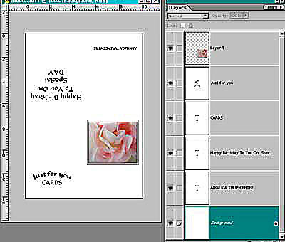
In order to correctly place each of the above items on the background so that they are correct when
the card is folded go to View and tick Rulers and Grids. You can then work out where the folds will
be by the measurements. The grids are removed in the sample for the sake of clarity.
Work one end first. It is just the same as making the montage except you probably will have
only one image the rest being script.
You will find that having set one side you have to go to Image> Rotate> 180° in order to
complete the other end as you can not type upside down!
If you want a card to be in landscape mode use your plain paper as before but remember when printing
go to, Open File> New and rotate the canvas to Landscape. Then follow the same routine.
To avoid having the folded version for cards then the alternative is to use Double Sided Photographic
Paper. This is not as expensive as you would expect, in fact often cheaper. You use one
side for the picture and back of the card and the other side for the message (in the mock up use two
different colours for the sketch and script).
You can of course do two cards at the same time on A4, using this Double sided paper, one above the
other. Each would be A6.
There are so many different ways to fold a card so always try it out on scrap paper before rushing
to print at least when you first start. When you get to the printing stage take care to put the
paper in the printer correctly or you will come up with some strange cards when they are folded!
We have made a web page, which describes making Greetings Cards and this may reinforce the ideas in
this Unit and perhaps give you a different slant on how to make cards. See http://salisburyu3a.org.uk/U3ADI/GreetingCards.html
There are so many ways to produce a calendar that it is almost impossible to choose one suitable for
this DI course.
Calendar Jigs are often to be found in magazines in November each year. A space is left for your
picture to be added and the advantage of these is that the dates are printed for the next year, a job
that could take a long time to type. They can be quite expensive if you are planning a
picture for each month. I found a local shop that would make a calendar up, adding a spiral,
a stiff back and an acetate front cover that finished it off nicely and was a modest price.
Simpler to construct and cheaper is to print a really good picture, with a most impressive border of
course! Then add one of those small printed date booklets.
We are not setting an exercise for a calendar. Now you have found out the basics of printing
your images, how to correct and enhance them using Elements you can use your computer for all your
needs the only limit being your own imagination.
No mention has been made in this course on printing papers. All along we like to hear any problems
you may have encountered. We are supposing
you are actually using what we have shown you!
It is no good quoting paper prices as they vary from one supplier to another and there are a lot of
suppliers, so we will just talk about the types of paper available.
For photography, to get a good result, you need Photographic quality ink jet paper. You can purchase
this from many different sources but we would recommend you buy papers from Photography firms as they
would be selling the correct paper and they should be able to give advice. They also sell the
most popular in different sizes, so you can test the results you can get with your printer using a
small packet.
Photographic papers have a surface that will take coloured inks and not soak in, dry rapidly and are
fade resistant. They come in various weights and sizes. For the cards we
were making earlier you would want A4 paper that is thick enough
to stand but not so thick that it can not be folded.
The surfaces of papers for photography also come in various types. We mentioned before that there
are double sided papers but as well there are glossy, matt, semi-gloss and pearl, all of which give
slightly different results. To a great degree it depends on your image as one surface can complement
one picture more than another. It is your choice to make when you see your test print. Art
papers behave slightly differently as they often have a matt finish and tend to use more ink, so experimenting
with the settings is important. Some of these papers come in a mixed trial pack so you can try
more than one type out before choosing, but they are usually more expensive, and not necessary the
best when you first start.
To make a test print for paper choice go to Test Prints. We are using between us, a selection of papers and have found that it pays us to sacrifice a whole sheet out of a packet for testing. We keep this sheet in the front of the packet, as it is often hard to tell the difference between each brand and it is easy to mix them up. We would advise you to get to know a paper really well before switching to another type. Writing the results down reminds you of any adjustments needed for that particular paper.